Background
Every day, first responders use location-based technology (i.e. maps) to navigate to emergency calls, analyze risk in their communities, assess resource allocation, and a myriad of other mission-critical applications. Some responders may use their own personal knowledge (a “mental map”). Some use a paper map (hand or computer drawn) that take the form of wall maps or map books in responder vehicles. Yet, a growing number are using high quality computer-based maps utilizing software based on the latest Geographic Information Systems (GIS). Not only do first responders use the latter form of information to navigate to calls, but they use information on the “map” to identify features relating to risks, threats and hazards that may cause harm to responders and the citizens they serve.
These maps can be in the form of
- Street maps
- Emergency or building pre-plans
- Pre-scripted mission plans
- Area map books
- Incident command and control applications
- Situational awareness viewers
- Damage assessment applications
- Crisis management systmes
- Any other maps based on the need and output ability
Incidents vary in scale, time and circumstance. While most incidents are smaller in size, large-scale incidents occur daily that involve local fire, ems, and police departments. The National Incident Management System (NIMS) is a systematic approach to guide public safety and the whole community to work seamlessly to prevent, protect, mitigate, respond and recover the effects of incidents of any size, type or scale. NIMS includes a common structure for command and contract known as the Incident Command System (ICS). Without going into the history too much, this system got its start over 50 years as a way to manage large scale wild-land fires. Some of the key things to remember:
- The system is scalable from smaller to larger incidents
- It is flexible and adaptable in need
- It can be used for any type of emergency incident
During an incident, maps are often used to visualize mission critical real-time information. As noted above, these maps can range from paper maps where a command aide marks up with pencil to a more professional map maintained by a GIS Specialist.
Regardless of what kind of map is used, there are several things that are consistent:
- There is information that existed before the incident
- Features exist to identify access information, features exist to help mitigating incidents, and features exist that show hazards that need to be handled or avoided – and so on.
- Data is collected actively and dynamically
A primary challenge to with any map is creating a consistent look so that information can be conveyed across different agencies, disciplines and jurisdictions. Such consistently presented information is commonly called a Common Operating Picture.
The Case for a Common Operating Picture
There are many definitions of a Common Operating Picture, and they all are pretty much correct. Definitions can be simple and complex. For this discussion, we’ll focus on just themap. Now there is argument that there isn’t a need to have a common or consistent map during an incident, rather what is important is the data. While good data is paramount, the need to have consistency in map products also is important. But why?
In an Operations Center environment, if there is a room full of firefighters, cops, emergency managers, and political leaders, having a common picture allows all parties to understand what a given symbol means. If someone knowledgeable with that map is unavailable, anyone can just look at the map and understand what it means – and use it as a key tool to aid decision making.
But what happens when a map ends up in the field?
Most maps used by responders are paper maps. Even with the advent of computer-based maps, the most reliable and abundant way to present information is to have a paper map. This is because the cost of abundant accessibility is somewhat prohibitive on a computer-based map — tablets and computers require a power source. Paper is lighter and more intuitive to use for most users. Now take an example where one agency shares a paper map with another agency. Even though there may be a legend available, when every second counts, it is helpful to have some consistency to reduce the amount of time to make informed decisions.
So why is it so hard to get a standard for map symbols?
Standards. A tough sell
First, it should be acknowledged that there is a success story for public safety map symbology — the standardization of symbols for wildland fire by the National Wildfire Coordination Group symbology is one such story. There are also standards for some symbols provided by major standard development organizations such as NFPA and ANSI. So why isn’t this symbology widely adopted and used by the public safety community nationwide?
Simply put, the symbols are mostly tailored to the needs of the wildland fire community, fire service, and in some cases the symbols don’t work when scaled from strategic to tactical map products. There are common features in the symbology for features that relate to “all-hazard” such as a Command Post, Base, and Staging, but it mainly included features pertinent only to wildland fires. Granted you can modify symbology for your needs, but most people who tried this found severe gaps in their ability to use the symbology for other than their intended purpose.
One effort to make a symbology set that included all threats and hazards was initiated years ago by the US Department of Homeland Security (DHS). The resulting work created four categories of symbols:
- Incident
- Infrastructure
- Sensors
- Command Features
The group created over 200 symbols for various feature, and the command and infrastructure symbology included the option to set a “status” of that feature in the rendering and a consistent look and feel. However, after some study and testing some things were realized
- The symbols were very graphical and would be impossible to hand draw on paper. This requirement is important since there is the definite possibility that a map user during an incident will need to hand draw a symbol on a map
- Some of the individual features were vague in application. For example, the Emergency Staging Symbol means different things to different response agencies.
- Even with the breadth of symbols there were still a lot of missing symbols.
So what needed to happen?
Incident Level Symbology Workgroup
The Start
In December of 2010, a plan came together to look at the interaction of tactical map symbols for the emergency services for pre-incident (think pre-plans or prescripted mission planning) and incident-level use. Through coordination and leadership from the NAPSG Foundation, the DHS S&T First Responder Group and FEMA’s National Integration Center put together a working group of public safety practitioners (representing fire service, EMS, law enforcement, and emergency management) with practical knowledge and field expertise in GIS and its application in operations. The focus of the group was to start with reviewing existing “standard” map symbols for tactical operations, and identify gaps as the basis for creating new common map symbols.
In the initial planning of the workgroup, some issues became fairly apparent:
- Incidents are complex and dynamic and very difficult to map
- Information about an incident can be collected before, during, or after an incident
- Even though most public safety agencies follow a standard (NIMS) in how the operate in an incident, the nuances of an incident are handled differently from one group to the next
With these and other issues in mind, planning for the working group started with the following:
- Assembling a small group of public safety practitioners from different parts of the country
- Preparing members of the working group ahead of time with “homework” so that when they came to an in-person meeting they would have a frame of reference for the discussion
- Researching past work completed – and identifying all existing standard symbols and lessons learned
The goals of the group from the outset included:
- Not re-inventing the wheel – but complimenting efforts already done
- Keeping in-mind that whatever we did had to be flexible and scalable. This is because every incident increases and decreases in size and is handled differently based on the agency in charge and resources available
- Considering all hazards possible for responders
- Considering the smallest incidents that use NIMS. Examples would be a structure fire, SWAT Incident, Search and rescue of one person, etc.
The Working Group
The group was assembled with the help of the NAPSG Foundation, consisting of people with two qualifications: practical hands on experience as an emergency responder and a practical knowledge of mapping/GIS. This group consisted of representation from the FDNY, Baltimore Fire Department, Colorado Springs Fire Department, Surrey (BC) Fire Department, Tualatin Valley Fire and Rescue, Seattle Fire Department, Florida State DEM, San Diego State University, Laurel (MD) Police Department, Redmond (OR) Fire Department, and the Kirkland (WA) Fire Department. All members of the group had experience responding to emergency calls and had practical experience using mapping software to produce maps for emergency incidents. The leadership of the group included Lieutenant Chris Rogers as the technical lead and Rebecca Harned as Project Manager.
Map Challenge
To get things started, the leads decided to develop a challenge for the workgroup based on a small incident that uses NIMS: a building fire. The tasks that needed to be completed were:
- Create a map that shows the following features
- Hazards on an incident
- Features that can help mitigate an incident
- Mapping of where command functions are located
- Present the map to the group
We conducted two conference calls before an in-person meeting in March 2011, in Seattle.
In-Person Meeting
At the in-person we:
- Presented the maps that were completed the months before
- Discussed each map
- Looked for common features and differences
This was accomplished on day one. The next two days were a discussion of what worked and what didn’t work. What was clear from the discussion was:
- With a room full of public safety personnel, we looked at things differently
- We needed symbology that fits within the framework of individual departments, but is consistent/relevant to other responders
- Information is collected before, during, and after the incident
- Needs to be consistent with use in the National Incident Management System. For example the guidelines need to fit with the chain of command structure, the tasks possible in each branch, and the scalability of possibility that other functions may be created that previously haven’t been considered.
After much discussion, we decided that the following is needed:
- We need to set “guidelines” instead of “standards”
- We need symbols that can be hand drawn
- Symbology can’t require a lot of training to understand
- Symbology must be usable in routine business of a public safety agency
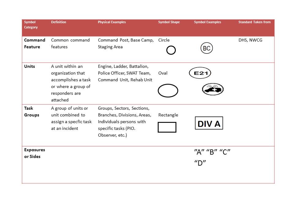
In short, we came up with different categories of symbols, including: pre-incident, hazard, and incident command symbols. Also we defined types of emergency maps. Key attributes of the symbols are:
- The shape of symbols is defined by the category
- What is in the shape of the symbols is dependent on the map output and use
- Can be hand drawn
Tactical vs. Strategic Maps
We discussed briefly the difference between “tactical” and ‘”strategic” mapping. These are standard NIMS terms. It is important to have separate products, because a map is a decision making tools and tactical/strategic decisions require different processes.
| Map | What is viewed on map | Examples | Symbols Examples |
| Tactical | A single problem emergency | Building fire, active shooter, kidnapping, single wildfire, search for single victim | NWCG |
| Strategic | A multiple problem emergency | Earthquake, Tsunami, Multiple wildland fires, urban conflagrations, civil disturbances | The DHS Symbology |
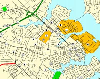
Tactical Map Sample
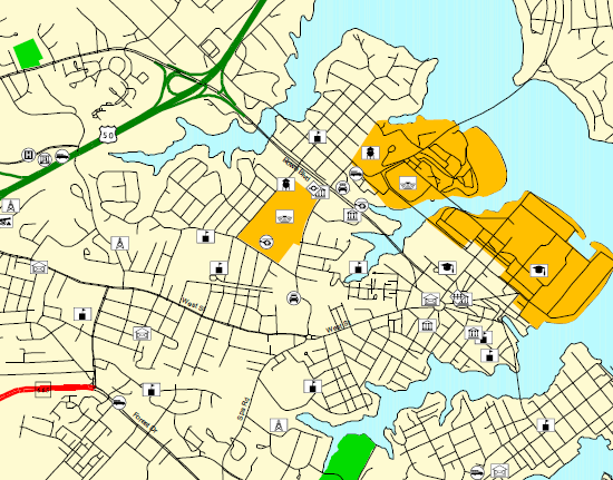
Strategic Map Sample
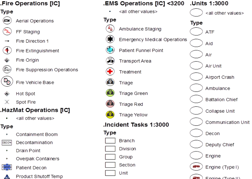
Incident Symbols Example
Symbols or features collected at the scene include:
- Collected at Incident
- Clear Background so that you aren’t filling in symbology
- May be hand drawn
Example of a legend with incident symbology:
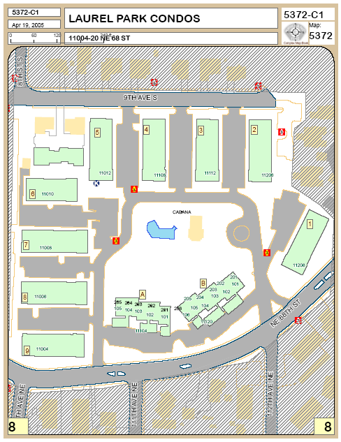
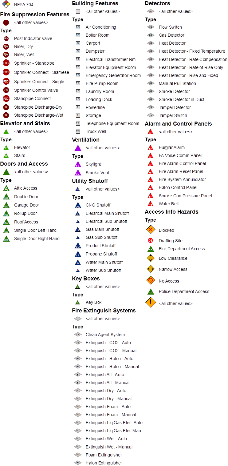
Pre-Incident Symbols
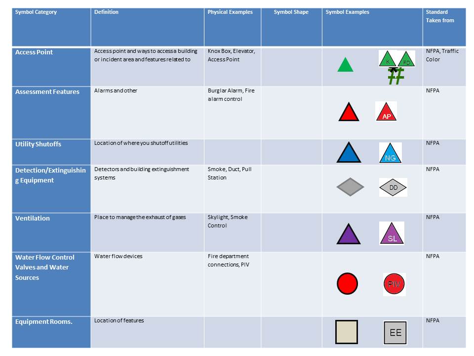
- Collected before incident
- NFPA 170
- Colored Background
- May use graphic or simple text
Preplan Symbols Example:
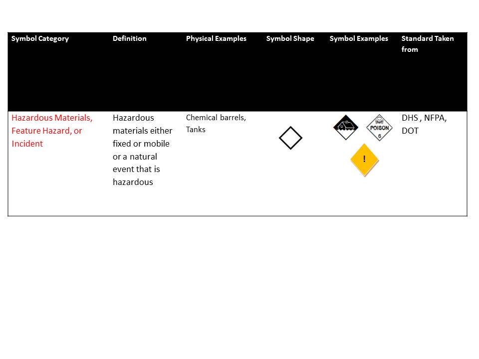
Hazard Symbols:
What’s Next?
We made a lot of headway in our workgroup. But we have a long way to go. First of all, consensus needs to be built with stakeholders like
- NFPA
- NWCG
- FEMA
- Others
We also need to test the work we did with a small scale incident drill. The intent was to find an existing multi-company drill and provide a no more than ½ hour training session on the symbology set. In addition, we would provide maps in both paper and computer format in various scales. Then evaluate the process.
Also one of the recognitions of the workgroup is that maps provided essentially two types of information for responders;
- How to access a feature or incident
- Identify hazards to either mitigate or avoid.
Part of our continued effort was to test ways to identify hazards on a map and evaluate whether we need to use a “risk assessment” approach or a “hazard identification” approach to identification.